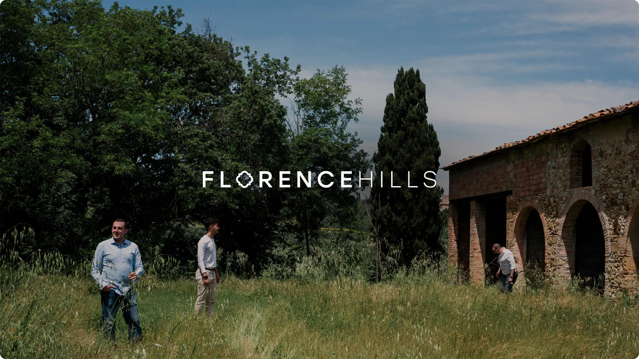
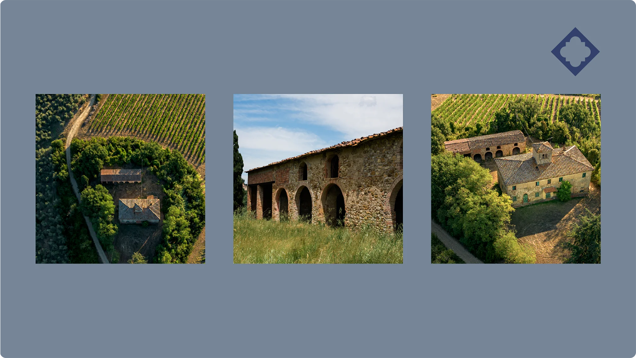
Florence Hills
Big Orange Media Project
Overview
Florence Hills is a high-end real estate development company dedicated to restoring historic Tuscan estates into exceptional luxury residences. Headquartered in Florence, Italy, the company was founded through the partnership of two complementary firms - a multidisciplinary civil engineering practice and a construction company specialising in period property restoration.
Following extensive market research and the definition of their brand mission, vision, and values, Florence Hills sought a creative partner who could translate their strategic foundations into a distinctive visual identity and digital presence. The goal was to develop a cohesive brand and website that would embody their vision, communicate their expertise, and resonate with their highly specific HNW and UHNW clientele.
The Challenge
As a newly established company, Florence Hills began without an existing brand identity, website, or digital presence. Operating within a highly niche luxury property market, the challenge was to create a visual and digital identity with absolute precision to attract and engage their highly-qualified audience while reflecting the exclusivity of the brand.
The identity needed to communicate Florence Hills’ premium positioning, demonstrate their authority and credibility as expert developers, and convey their comprehensive, end-to-end service - a distinctive proposition within the Italian real estate landscape.
Equally important was the ambition to build a timeless, enduring brand that could be applied consistently across all touchpoints. Florence Hills sought an identity built for longevity, one that would embody both heritage and innovation, and entrusted Big Orange Media with bringing that vision to life through a complete brand and digital design partnership.
Solution/Approach
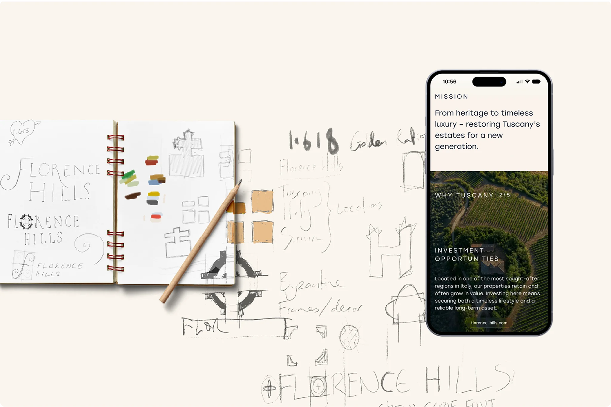
1. Logo Design
Guided by Florence Hills’ vision and values, we began by developing a series of logo concepts to explore different creative directions. These initial designs served as a valuable tool for shaping discussion and helping the team visualise how their brand could take form. Through a considered and iterative process, we refined the concepts into a distinctive final design that captures the brand’s dual focus on luxury and heritage.
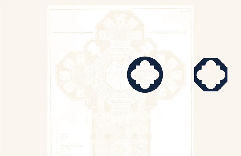
The final logo draws subtle inspiration from the original architectural plans of Florence’s Duomo cathedral, expressed in a simplified and contemporary form. Two logo variations were produced to ensure flexibility and adaptability across both digital and print applications.

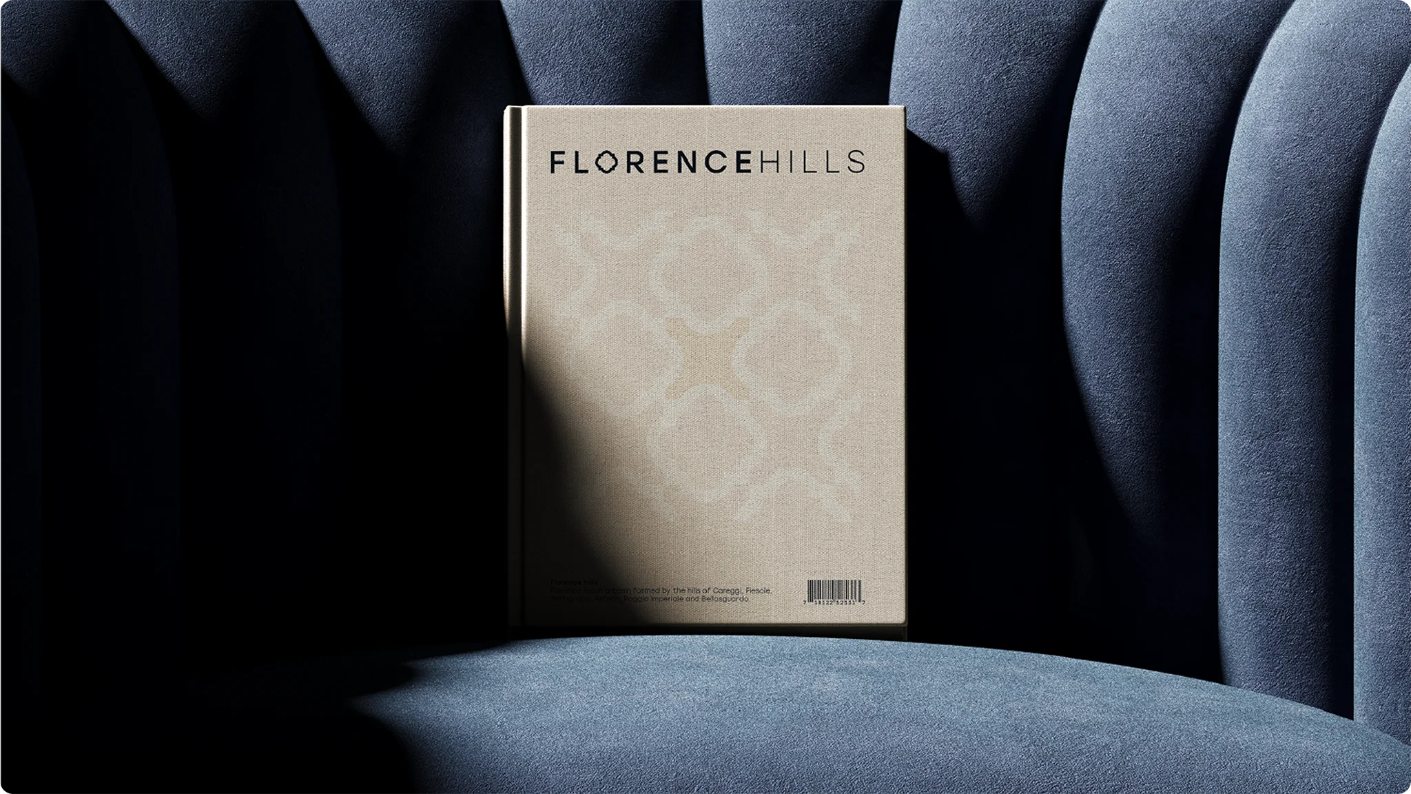
2. Full Visual Identity
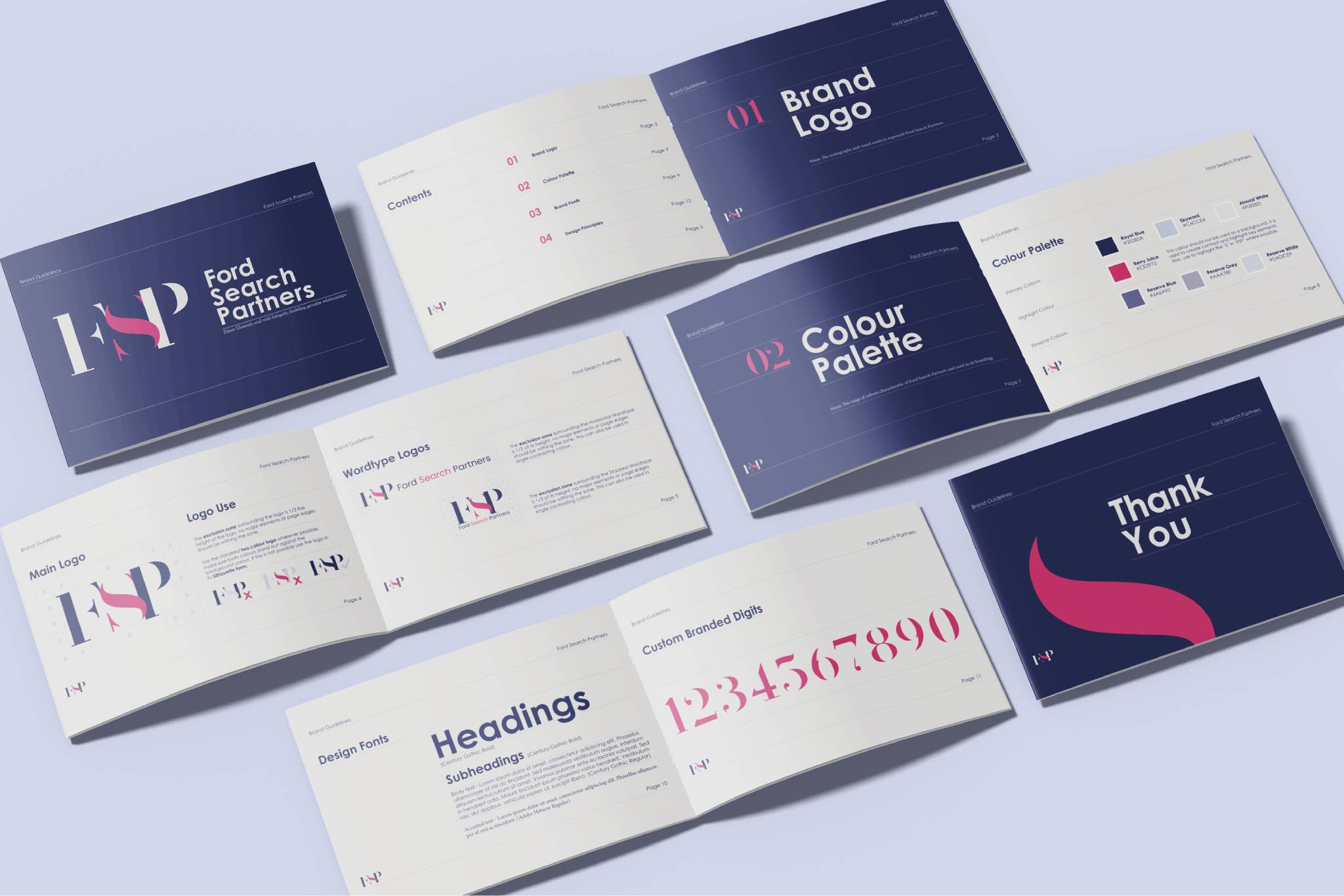
To shape Florence Hills’ visual identity, we began by conducting a detailed survey to gain a clear understanding of the direction the team envisioned. Based on these insights, we developed a series of creative concepts encompassing colour palettes, typography, iconography, and asset mock-ups.
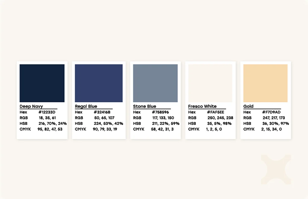
Once a defined direction was established, we refined every element and compiled a comprehensive Brand Guidelines document to ensure consistency across all applications. The final colour palette - a combination of off-white, deep blues, and an accent gold - was chosen to balance the brand’s sense of luxury and prestige with its innovative, contemporary character.
As an extension of the logo, we designed a family of linked icons and three tessellated graphic patterns, intended for use across both print materials and branded office products such as brochures, notebooks, and upholstery. Complementary fonts were carefully selected to establish a clear typographic hierarchy, and our designers produced a detailed set of best-practice guidelines to maintain brand consistency and professionalism across all assets.

3. Website Design & Development
Building on the established brand identity, we designed and developed a website that embodies Florence Hills’ refined aesthetic and strategic objectives. The site architecture was planned to balance elegance with usability, ensuring an intuitive user journey and clear presentation of the company’s premium services.
Drawing from the visual identity, the website integrates the signature colour palette, typography, and iconography to create a cohesive and immersive brand experience. Each page was crafted to communicate professionalism and trust, while maintaining visual warmth and accessibility.
The development phase prioritised performance and responsiveness across all devices, with a streamlined content management system enabling easy updates. Additional custom elements were designed for the property listings, projected for easy additions to the website, and enabling future developments of a search function. The result is a digital presence that not only captures the essence of Florence Hills but also functions as a dynamic platform for engagement and growth.
Client Testimonial
From the very beginning, working with Big Orange Media felt like a true partnership. They took the time to understand our vision, our values, and the level of precision required for a brand like Florence Hills.
Their team became an extension of ours - creative, strategic, and completely aligned with our objectives. The outcome goes far beyond design; it’s a brand and digital presence that reflect exactly who we are and where we’re going.
Outcome
The completed project delivered a sophisticated, fully integrated brand identity and digital presence that positions Florence Hills as a leading name in luxury real estate development. The new visual identity has provided the company with a timeless and versatile brand system, adaptable across print, digital, and architectural applications. The website now serves as a central hub for brand storytelling and client engagement, offering a seamless experience that aligns with the expectations of a high-net-worth audience. Together, the brand and website communicate expertise, heritage, and exclusivity - establishing a strong foundation for growth, visibility, and long-term recognition in the competitive Tuscan property market.
Results
The launch of the Florence Hills brand and website marked the company’s first digital presence, establishing a strong platform for credibility and growth. Within the first months post-launch, the site recorded an average session duration exceeding 2.5 minutes and multiple page views per visit, demonstrating meaningful engagement from its niche audience. Early analytics also show consistent traffic from high-value regions, reflecting successful alignment with the intended HNW and UHNW market.
The refined visual identity has been well received by partners and stakeholders, praised for its authenticity and sophistication. Together, the brand and website have positioned Florence Hills as a distinctive and trusted name in luxury property development - a foundation designed for long-term recognition and expansion.
Client Testimonial
Collaborating with Big Orange Media has been instrumental in helping us connect authentically with our audience. They developed a brand identity and website that speak directly to our clients - discerning individuals who value heritage, quality, and a sartorial experience. Every element, from the design language to the visual hierarchy, feels perfectly aligned with the expectations of the high-net-worth market we serve. The result is a brand experience that feels both timeless and personal, and that truly reflects the calibre of our work.