Eight Bars Brewery
big orange media project
Overview
Eight Bars is an Italian craft beer brand looking to make a striking entrance into a competitive, tradition-rich market. The brand name, inspired by the elegant geometry of a bicycle frame, was intended to evoke themes of precision, balance, and smoothness. Big Orange Media was brought on board to translate this concept into a compelling visual identity that would stand out and resonate with a modern audience.
Our Approach
We began by developing three distinct brand concepts, each interpreting the bicycle theme in a different way. Working closely with the Eight Bars team, we combined internal creative exploration with customer feedback and market research to guide the selection of the final direction.
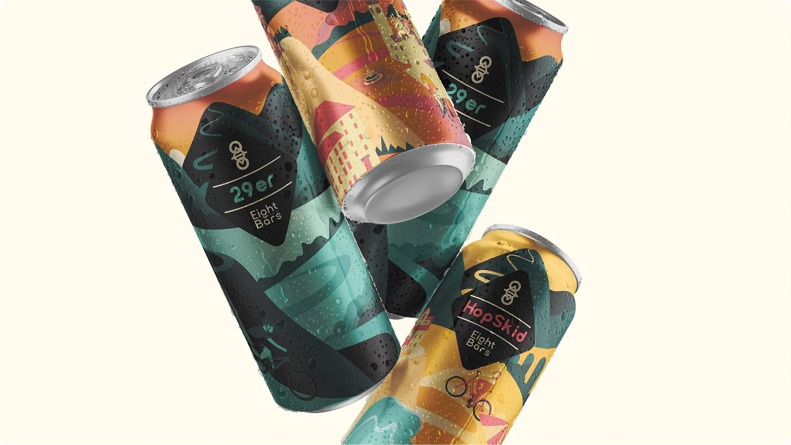
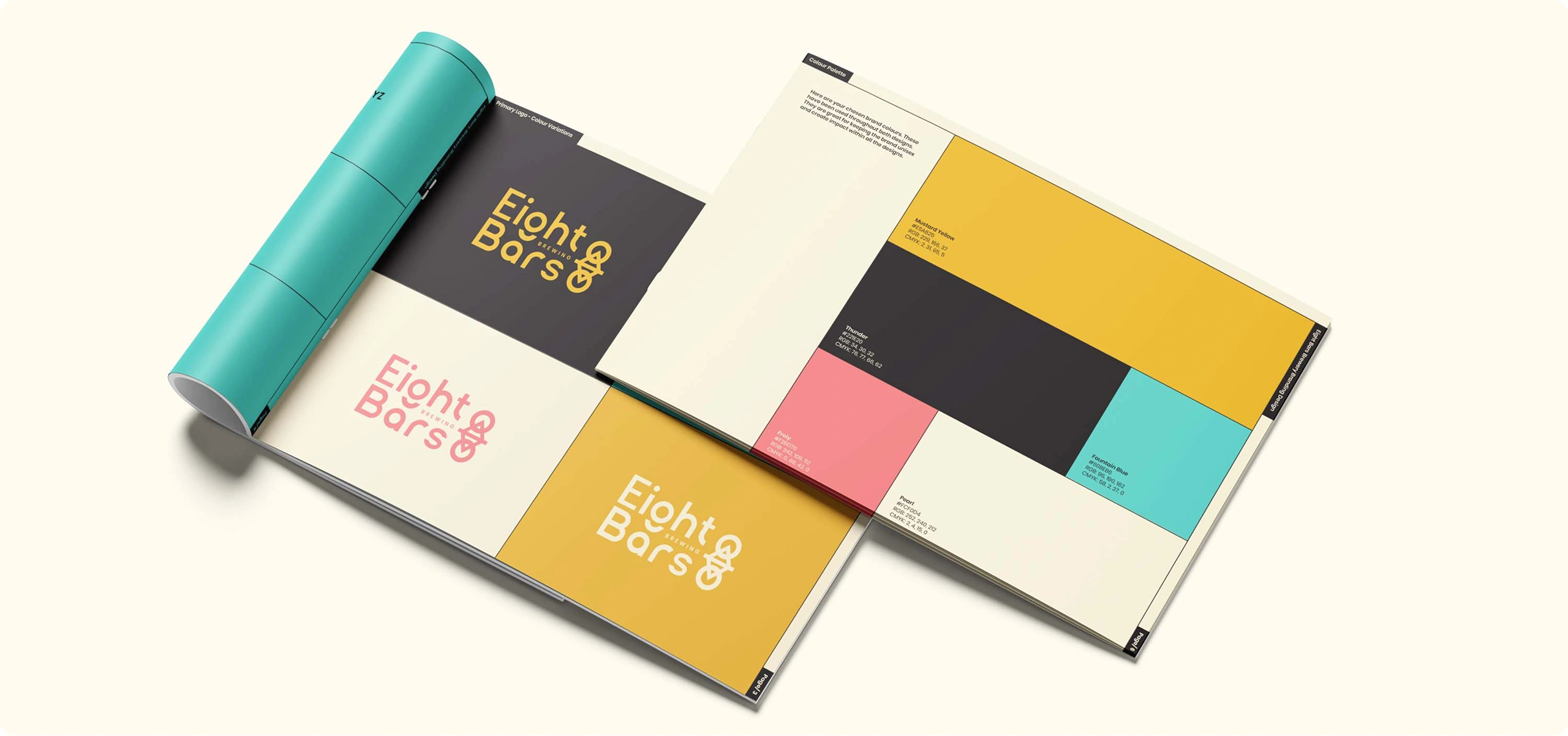
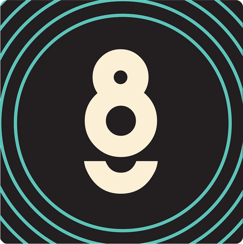
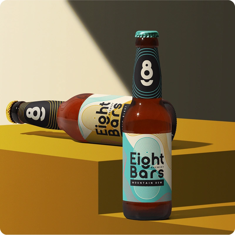
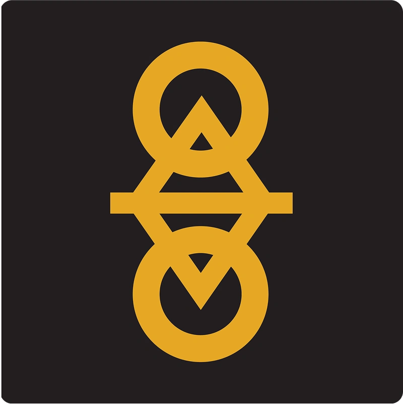
Once the clients favourite concept was chosen, we refined it to deliver a clean, contemporary identity. The final logo was a stylised abstraction of a bicycle frame, paired with a custom-designed, bold sans-serif wordmark. Notably, the letter ‘g’ in ‘Eight’ was tailored to mimic the shape of a wheel, giving the identity a memorable and unique twist.
Bright, energetic colours were introduced to communicate Eight Bars’ innovative spirit while helping the brand pop on shelves and in digital spaces. We extended the identity with promotional assets including a series of striking posters that paired the new branding with iconic Italian landscapes and architectural landmarks.
Outcome
The result was a cohesive, visually arresting brand identity that honours the inspiration behind the name ‘Eight Bars’ while positioning the brewery as an exciting new player in the craft beer space.
“Working with Big Orange Media was a success from start to finish. The team listened carefully to what we wanted to achieve, and created a brand identity that hit the brief and exceeded our expectations.
It has been exciting to see our brilliant new brand on bottles and we wouldn't hesitate to work with Big Orange again in future!”
Head of Marketing, Eight Bars Brewery